This article is about making a prediction on the number of infected (confirmed, death and recovered cases) people by the Coronavirus (COVID-19).
This is the second part of our serial of articles about predicting the outcome of the Coronavirus (COVID-19).
In order to understand the dataset we use, and how it is connected, we suggest you read the first post of the series about prediction the сpread of Coronavirus (COVID-19).
Here is also the third post about how to fight against the coronavirus with machine learning.
In this post, we are going to use stochastic processes in order to predict the number of infected people by the Coronavirus (COVID-19) in the next 30 days. You can also make predictions for the next year, since it is very easy as you will see in the next section.
Here are two books you must read to improve your knowledge:
Deep Learning with Python – Buy from Amazon

Hands-On Machine Learning with Scikit-Learn and TensorFlow: Concepts, Tools, and Techniques to Build Intelligent Systems – Buy from Amazon

Pattern Recognition and Machine Learning (Information Science and Statistics) – Buy from Amazon

Pattern Recognition and Machine Learning
Building the prediction models
In probability theory, a stochastic process is a mathematical object usually defined as a family of random variables. Since our problem is a Time Series Analyses Problem, we are going to use stochastic processes that can help us determine i.e. predict the outcome in such situations.
If you are not familiar with Time Series Analyses, stochastic processes are the first thing you are going to met when you start learning, since they are generally understandable and easier than anything else.
In this article, we are going to show you the practical implementation on some of those, including AR, ARMA, ARIMA, and SARIMA.
import pandas as pd
import numpy as np
from matplotlib import pyplot as plt
from statsmodels.tsa.ar_model import AR
import statsmodels.api as sm
from statsmodels.tsa.arima_model import ARIMA
from statsmodels.tsa.statespace.sarimax import SARIMAX
df = pd.read_csv(‘datasets/covid_19_data.csv’,parse_dates=[‘Last Update’])
df.rename(columns={‘ObservationDate’:‘Date’, ‘Country/Region’:‘Country’}, inplace=True)
df_date = df.groupby([“Date”])[[‘Confirmed’, ‘Deaths’, ‘Recovered’]].sum().reset_index()
date_confirmed = df_date[[‘Date’, ‘Confirmed’]]
date_death = df_date[[‘Date’, ‘Deaths’]]
date_recovered = df_date[[‘Date’, ‘Recovered’]]
print(date_death)
for index, row in date_confirmed.iterrows():
if row[‘Confirmed’] is None:
row[‘Confirmed’] = 0.0
for index, row in date_death.iterrows():
if row[‘Deaths’] is None:
row[‘Deaths’] = 0.0
for index, row in date_recovered.iterrows():
if row[‘Recovered’] is None:
row[‘Recovered’] = 0.0
With the code above we are importing the libraries, we need for this problem. We import the data in the form of a data frame, we organize it by the Date, and then we create separate frames for the confirmed, death and recovered cases since it is better organized that way.
Again in order to understand what are we talking about, take a look at the previous post of the serial by clicking here. The first model we are going to create is the Autoregressive model.
In statistics, an autoregressive (AR) model is a representation of a type of random process. It is used to describe a certain time-varying process.
The AR model specifies that the output variable depends linearly on its own previous values and on a stochastic term.
model_ar_confirmed = AR(np.asanyarray(date_confirmed[‘Confirmed’]))
model_fit_ar_confirmed = model_ar_confirmed.fit()
predict_ar_confirmed = model_fit_ar_confirmed.predict(10, len(date_confirmed) + 40)
print(predict_ar_confirmed)
plt.xlabel(‘Dates’)
plt.ylabel(‘Cases’)
plt.plot(date_confirmed[‘Confirmed’], label=‘Confirmed’, color=‘blue’)
plt.plot(predict_ar_confirmed, label=‘Predicted unknown data’, color=‘orange’)
plt.plot(predict_ar_confirmed[:len(predict_ar_confirmed)-30], label=‘Predicted known data’, color=‘red’)
plt.title(‘Confirmed cases vs Predicted Confirmed cases’)
plt.legend()
plt.show()
model_ar_death = AR(np.asanyarray(date_death[‘Deaths’]))
model_fit_ar_death = model_ar_death.fit()
predict_ar_death = model_fit_ar_death.predict(10, len(date_death) + 40)
print(predict_ar_death)
plt.xlabel(‘Dates’)
plt.ylabel(‘Cases’)
plt.plot(date_death[‘Deaths’], label=‘Death’, color=‘blue’)
plt.plot(predict_ar_death, label=‘Predicted unknown data’, color=‘orange’)
plt.plot(predict_ar_death[:len(predict_ar_death)-30], label=‘Predicted known data’, color=‘red’)
plt.title(‘Death cases vs Predicted Death cases’)
plt.legend()
plt.show()
model_ar_recovered = AR(np.asanyarray(date_recovered[‘Recovered’]))
model_fit_ar_recovered = model_ar_recovered.fit()
predict_ar_recovered = model_fit_ar_recovered.predict(10, len(date_recovered) + 40)
print(predict_ar_recovered)
plt.xlabel(‘Dates’)
plt.ylabel(‘Cases’)
plt.plot(date_recovered[‘Recovered’], label=‘Recovered’, color=‘blue’)
plt.plot(predict_ar_recovered, label=‘Predicted unknown data’, color=‘orange’)
plt.plot(predict_ar_recovered[:len(predict_ar_recovered)-30], label=‘Predicted known data’, color=‘red’)
plt.title(‘Recovered cases vs Predicted Recovered cases’)
plt.legend()
plt.show()
plt.subplot(121)
plt.title(“Coronavirus data”)
plt.plot(date_confirmed[‘Confirmed’], label=‘Confirmed’, color=‘blue’)
plt.plot(date_death[‘Deaths’], label=‘Deaths’, color=‘red’)
plt.plot(date_recovered[‘Recovered’], label=‘Recovered’, color=‘green’)
plt.legend()
plt.subplot(122)
plt.title(“Coronavirus data predicted”)
plt.plot(predict_ar_confirmed, color=‘orange’)
plt.plot(predict_ar_confirmed[:len(predict_ar_confirmed)-30], label=‘Predicted Confirmed ‘, color=‘blue’)
plt.plot(predict_ar_death, color = ‘orange’)
plt.plot(predict_ar_death[:len(predict_ar_death)-30], label=‘Predicted Death’, color = ‘red’)
plt.plot(predict_ar_recovered, color = ‘orange’)
plt.plot(predict_ar_recovered[:len(predict_ar_recovered)-30], label=‘Predicted Recovered’, color = ‘green’)
plt.legend()
plt.show()
With the code above we are forecasting the outcome for the conformed, death and recovered cases. We plot each of their values with the corresponding forecast, in order to compare them.
We can see that the prediction is being made for the next 30 periods, i.e. the next 30 days. Then there is one plot with two subplots that represent the predicted values and the already known values for the data.
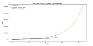
Image 1: Stochastic processes for Confirmed cases versus Predicted Confirmed cases (AR)
On Image 1 we can see the comparison between the confirmed cases and the prediction made for the confirmed cases using AR model.
As the legend says, and as you can see in the code, we made predictions for the periods starting from January 22-nd, 2020, up until April 16th, 2020 (in the AR model case April 26th, 2020).
The last 30 days are the prediction of the model, that’s why the legend says, unknown data. As you can see, when it predicts for the periods between January 22-nd to March 16th both functions (blue and red) are closer to each other.
The same rules are for all of the rest of the graphics.

Image 2: Stochastic processes for Death cases versus Predicted Death cases (AR)

Image 3: Recovered cases versus Predicted Recovered cases (AR)
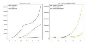
Image 4: Comparison between the current and predicted data (AR)
fig = plt.figure()
ax1 = fig.add_subplot(211)
fig = sm.graphics.tsa.plot_acf(date_confirmed[‘Confirmed’], lags=10, ax=ax1) #
ax2 = fig.add_subplot(212)
fig = sm.graphics.tsa.plot_pacf(date_confirmed[‘Confirmed’], lags=10, ax=ax2)#
plt.show()
With the code above we are going to plot the ACF(Autocorrelation) and PACF(Partial Autocorrelation) graphics, in order to help ourselves with determining the values of the parameters of the ARMA/ARIMA/SARIMA models.
If you are new to this, please check out the posts below, since this can be tricky and complicated to understand, and it is too big of a process to explain it in this post:
- Identifying the numbers of AR or MA terms in an ARIMA model
- Introduction to ARIMA: nonseasonal models
model_ma_confirmed = ARIMA(np.asanyarray(date_confirmed[‘Confirmed’]), order=(2,0,0))
model_fit_ma_confirmed = model_ma_confirmed.fit(disp=False)
predict_ma_confirmed = model_fit_ma_confirmed.predict(1, len(date_confirmed)+31)
print(predict_ma_confirmed)
plt.xlabel(‘Dates’)
plt.ylabel(‘Cases’)
plt.plot(date_confirmed[‘Confirmed’], label=‘Confirmed’, color=‘blue’)
plt.plot(predict_ma_confirmed, label=‘Predicted unknown data’, color=‘orange’)
plt.plot(predict_ma_confirmed[:len(predict_ma_confirmed)-31], label=‘Predicted known data’, color=‘red’)
plt.title(‘Confirmed cases vs Predicted Confirmed cases’)
plt.legend()
plt.show()
With the code above we are forecasting the values for the confirmed cases using the ARIMA model. ARIMA model is a generalized form of the ARMA model, which is a combination of AR and MA (moving average) models.
The ARIMA model is determined by three values (p number of AR, d the integration order and q the number of MA). If d is equal to 0 (zero) then we have the ARMA model, as you can see in this example. For MA we have 0 (zero) and for the AR we have 2.
These numbers can be determined by experimenting and trying, or by looking at the ACF and PACF plots. Please open the links above in order to understand why we have chosen these values.

Image 5: ACF and PACF for the confirmed cases of infected people by the coronavirus
The value for the AR (p) is easiest to determine since it looks for periods in the PACF plot. In this case, we can see that we can’t see periods where values stand out too much, so we are going to take the number of the most significant values (the first two).
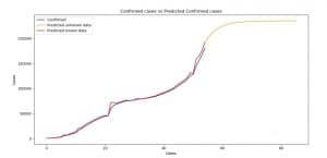
Image 6: Confirmed cases versus Predicted Confirmed cases (ARIMA)
On Image 6 you can see the comparison between the current and predicted values for the confirmed cases. The rules are the same as for the AR model.
This is the rest of the code for the ARIMA model:
fig = plt.figure()
ax1 = fig.add_subplot(211)
fig = sm.graphics.tsa.plot_acf(date_death[‘Deaths’], lags=10, ax=ax1) #
ax2 = fig.add_subplot(212)
fig = sm.graphics.tsa.plot_pacf(date_death[‘Deaths’], lags=10, ax=ax2)#
plt.show()
model_ma_death = ARIMA(np.asanyarray(date_death[‘Deaths’]), order=(1, 0, 0))
model_fit_ma_death = model_ma_death.fit(disp=False)
predict_ma_death = model_fit_ma_death.predict(1, len(date_death) + 31)
print(predict_ma_death)
plt.xlabel(‘Dates’)
plt.ylabel(‘Cases’)
plt.plot(date_death[‘Deaths’], label=‘Death’, color=‘blue’)
plt.plot(predict_ma_death, label=‘Predicted unknown data’, color=‘orange’)
plt.plot(predict_ma_death[:len(predict_ma_death)-31], label=‘Predicted known data’, color=‘red’)
plt.title(‘Death cases vs Predicted Death cases’)
plt.legend()
plt.show()
fig = plt.figure()
ax1 = fig.add_subplot(211)
fig = sm.graphics.tsa.plot_acf(date_recovered[‘Recovered’], lags=10, ax=ax1) #
ax2 = fig.add_subplot(212)
fig = sm.graphics.tsa.plot_pacf(date_recovered[‘Recovered’], lags=10, ax=ax2)#
plt.show()
model_ma_recovered = ARIMA(np.asanyarray(date_recovered[‘Recovered’]), order=(2, 0, 0))
model_fit_ma_recovered = model_ma_recovered.fit(disp=False)
predict_ma_recovered = model_fit_ma_recovered.predict(1, len(date_recovered) + 31)
print(predict_ma_recovered)
plt.xlabel(‘Dates’)
plt.ylabel(‘Cases’)
plt.plot(date_recovered[‘Recovered’], label=‘Recovered’, color=‘blue’)
plt.plot(predict_ma_recovered, label=‘Predicted unknown data’, color=‘orange’)
plt.plot(predict_ma_recovered[:len(predict_ma_recovered)-31], label=‘Predicted known data’, color=‘red’)
plt.title(‘Recovered cases vs Predicted Recovered cases’)
plt.legend()
plt.show()
plt.subplot(121)
plt.title(“Coronavirus data”)
plt.plot(date_confirmed[‘Confirmed’], label=‘Confirmed’, color=‘blue’)
plt.plot(date_death[‘Deaths’], label=‘Deaths’, color=‘red’)
plt.plot(date_recovered[‘Recovered’], label=‘Recovered’, color=‘green’)
plt.legend()
plt.subplot(122)
plt.title(“Coronavirus data predicted”)
plt.plot(predict_ma_confirmed, color=‘orange’)
plt.plot(predict_ma_confirmed[:len(predict_ma_confirmed)-31], label=‘Predicted Confirmed ‘, color=‘blue’)
plt.plot(predict_ma_death, color = ‘orange’)
plt.plot(predict_ma_death[:len(predict_ma_death)-31], label=‘Predicted Death’, color = ‘red’)
plt.plot(predict_ma_recovered, color = ‘orange’)
plt.plot(predict_ma_recovered[:len(predict_ma_recovered)-31], label=‘Predicted Recovered’, color = ‘green’)
plt.legend()
plt.show()

Image 7: ACF and PACF for the death cases by the coronavirus
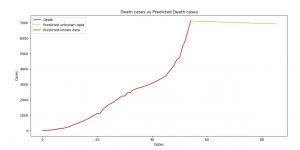
Image 8: Death cases versus Predicted Death cases (ARIMA)
Here are three more books I recommend you to read and upgrade yourself:
Time Series Analysis 1st Edition – Buy from Amazon

Artificial Intelligence: A Modern Approach 3rd Edition – Buy from Amazon

AI Superpowers: China, Silicon Valley, and the New World Order – Buy from Amazon
![]()
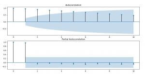
Image 9: ACF and PACF for recovered cases

Image 10: Recovered cases versus Predicted Recovered cases (ARIMA)
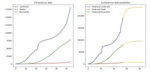
Image 11: Comparison between the current and predicted data (ARIMA)
The next model we are going to use is the SARIMA model. SARIMA combines the ARIMA model with the ability to perform the same autoregression, differencing, and moving average modeling at the seasonal level.
model_sarima_confirmed = SARIMAX(np.asanyarray(date_confirmed[‘Confirmed’]), order=(2,1,0), seasonal_order=(1,1,0,12))
model_fit_sarima_confirmed = model_sarima_confirmed.fit(disp=False, enforce_stationarity=False)
predict_sarima_confirmed = model_fit_sarima_confirmed.predict(1, len(date_confirmed)+31)
print(predict_sarima_confirmed)
plt.xlabel(‘Dates’)
plt.ylabel(‘Cases’)
plt.plot(date_confirmed[‘Confirmed’], label=‘Confirmed’, color=‘blue’)
plt.plot(predict_sarima_confirmed, label=‘Predicted unknown data’, color=‘orange’)
plt.plot(predict_sarima_confirmed[:len(predict_sarima_confirmed)-31], label=‘Predicted known data’, color=‘red’)
plt.title(‘Confirmed cases vs Predicted Confirmed cases’)
plt.legend()
plt.show()
With the code above we make prediction for the number of confirmed cases using the SARIMA model, we are plotting the prediction and the current in order to compare them, as we’ve done with the other models before.
The (P,D,Q,s) order of the seasonal component of the model for the AR parameters, differences, MA parameters, and periodicity. d must be an integer indicating the integration order of the process, s is an integer giving the periodicity (number of periods in season), often it is 4 for quarterly data or 12 for monthly data.
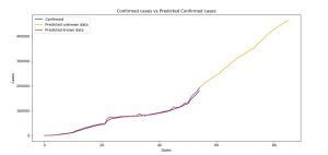
Image 12: Confirmed cases of infected people versus the Predicted Confirmed cases (SARIMA)
On Image 12, you can see the plot of the current data for the confirmed cases and the forecasted data for the same category. The rules are the same as for the two previous models.
Here is the rest of the code and plots for the SARIMA model:
model_sarima_death = SARIMAX(np.asanyarray(date_death[‘Deaths’]), order=(1,1,0), seasonal_order=(1,1,0,12))
model_fit_sarima_death = model_sarima_death.fit(disp=False, enforce_stationarity=False)
predict_sarima_death = model_fit_sarima_death.predict(1, len(date_death)+31)
print(predict_sarima_death)
plt.xlabel(‘Dates’)
plt.ylabel(‘Cases’)
plt.plot(date_death[‘Deaths’], label=‘Death’, color=‘blue’)
plt.plot(predict_sarima_death, label=‘Predicted unknown data’, color=‘orange’)
plt.plot(predict_sarima_death[:len(predict_sarima_death)-31], label=‘Predicted known data’, color=‘red’)
plt.title(‘Death cases vs Predicted Death cases’)
plt.legend()
plt.show()
model_sarima_recovered = SARIMAX(np.asanyarray(date_recovered[‘Recovered’]), order=(2,1,0), seasonal_order=(1,1,0,12))
model_fit_sarima_recovered = model_sarima_recovered.fit(disp=False, enforce_stationarity=False)
predict_sarima_recovered = model_fit_sarima_recovered.predict(1, len(date_recovered)+31)
print(predict_sarima_recovered)
plt.xlabel(‘Dates’)
plt.ylabel(‘Cases’)
plt.plot(date_recovered[‘Recovered’], label=‘Recovered’, color=‘blue’)
plt.plot(predict_sarima_recovered, label=‘Predicted unknown data’, color=‘orange’)
plt.plot(predict_sarima_recovered[:len(predict_sarima_recovered)-31], label=‘Predicted known data’, color=‘red’)
plt.title(‘Recovered cases vs Predicted Recovered cases’)
plt.legend()
plt.show()
plt.subplot(121)
plt.title(“Coronavirus data”)
plt.plot(date_confirmed[‘Confirmed’], label=‘Confirmed’, color=‘blue’)
plt.plot(date_death[‘Deaths’], label=‘Deaths’, color=‘red’)
plt.plot(date_recovered[‘Recovered’], label=‘Recovered’, color=‘green’)
plt.legend()
plt.subplot(122)
plt.title(“Coronavirus data predicted”)
plt.plot(predict_sarima_confirmed, color=‘orange’)
plt.plot(predict_sarima_confirmed[:len(predict_sarima_confirmed)-31], label=‘Predicted Confirmed ‘, color=‘blue’)
plt.plot(predict_sarima_death, color = ‘orange’)
plt.plot(predict_sarima_death[:len(predict_sarima_death)-31], label=‘Predicted Death’, color = ‘red’)
plt.plot(predict_sarima_recovered, color = ‘orange’)
plt.plot(predict_sarima_recovered[:len(predict_sarima_recovered)-31], label=‘Predicted Recovered’, color = ‘green’)
plt.legend()
plt.show()
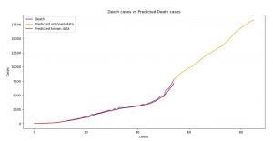
Image 13: Death cases versus Predicted Death cases (SARIMA)

Image 14: Recovered cases versus Predicted Recovered cases

Image 15: Comparison between the current and predicted data (SARIMA)
To see which of our models predicted the data the best we are going to use Spearman correlation. Now keep in mind we used the whole dataset as a training, as the problem suggested (find it here) so our comparison will be made on the training dataset.
The correlation will be close to 1 since it is already known data, but we are going to use it, for the sake of showing you how can you do it.
Next month we will make a post where we find the Spearman correlation between our predicted values and the values that the data will have then since the competition creators stated that they update the data on daily bases. Then we will for sure know, how good our models are.
The Spearman correlation between two variables is equal to the Pearson correlation between the rank values of those two variables; while Pearson’s correlation assesses linear relationships, Spearman’s correlation assesses monotonic relationships (whether linear or not).
If there are no repeated data values, a perfect Spearman correlation of +1 or −1 occurs when each of the variables is a perfect monotone function of the other.
The Spearman correlation between two variables will be high when observations have a similar (or identical for a correlation of 1) rank between the two variables, and low when observations have a dissimilar (or fully opposed for a correlation of −1) rank between the two variables.
import scipy.stats as stats
#CONFIRMED
spearman_ar_confirmed = stats.spearmanr(date_confirmed[‘Confirmed’], predict_ar_confirmed[:len(predict_ar_confirmed)-31])[0]
spearman_arima_confirmed = stats.spearmanr(date_confirmed[‘Confirmed’], predict_ma_confirmed[:len(predict_ma_confirmed)-31])[0]
spearman_sarima_confirmed = stats.spearmanr(date_confirmed[‘Confirmed’], predict_sarima_confirmed[:len(predict_sarima_confirmed)-31])[0]
print()
print(“SPEARMAN CONFIRMED AR: “, spearman_ar_confirmed)
print(“SPEARMAN CONFIRMED ARIMA: “, spearman_arima_confirmed)
print(“SPEARMAN CONFIRMED SARIMA: “, spearman_sarima_confirmed)
#DEATH
spearman_ar_death = stats.spearmanr(date_death[‘Deaths’], predict_ar_death[:len(predict_ar_death)-31])[0]
spearman_arima_death = stats.spearmanr(date_death[‘Deaths’], predict_ma_death[:len(predict_ma_death)-31])[0]
spearman_sarima_death = stats.spearmanr(date_death[‘Deaths’], predict_sarima_death[:len(predict_sarima_death)-31])[0]
print()
print(“SPEARMAN DEATH AR: “, spearman_ar_death)
print(“SPEARMAN DEATH ARIMA: “, spearman_arima_death)
print(“SPEARMAN DEATH SARIMA: “, spearman_sarima_death)
#RECOVERED
spearman_ar_recovered = stats.spearmanr(date_recovered[‘Recovered’], predict_ar_recovered[:len(predict_ar_recovered)-31])[0]
spearman_arima_recovered = stats.spearmanr(date_recovered[‘Recovered’], predict_ma_recovered[:len(predict_ma_recovered)-31])[0]
spearman_sarima_recovered = stats.spearmanr(date_recovered[‘Recovered’], predict_sarima_recovered[:len(predict_sarima_recovered)-31])[0]
print()
print(“SPEARMAN RECOVERED AR: “, spearman_ar_recovered)
print(“SPEARMAN RECOVERED ARIMA: “, spearman_arima_recovered)
print(“SPEARMAN RECOVERED SARIMA: “, spearman_sarima_recovered)

Image 16: Results of the Spearman correlation
On Image 16 you can see the results of the Spearman correlation. As we’ve mentioned, the values are going to be high, but the point was to show you, how you can use it. If you’ve ever wondered, this is what overfitting looks like, so you’ve learned something plus :).
From the results, the best prediction for the confirmed cases – made the Autoregressive model, for the death cases – the ARIMA model and for the recovered cases – the Autoregressive and the SARIMA model.
Conclusion
Coronavirus (COVID-19) is a serious thing, and it is all around us. If we don’t act together, it will destroy not just our lives, but the lives of the generations that follow. That’s why it should be our mission to work on this threat together, as a unit, and to bring as much as we can to stop it.
This solution is just another way to predict the spread of the Coronavirus as we’ve done in the previous post of these series.
So in order to understand this post, check out our other posts about
- Forecasting the Spread of Coronavirus (COVID-19) Using Python
- Here’s How Machine Learning Can Help In The Fight Against Coronavirus (COVID-19)
- This Is How Python Can Defeat The Coronavirus (COVID-19)
- How To Predict Coronavirus (COVID-19) Cases Using Deep Learning in Python
Also do check out:
- 11 Classical Time Series Forecasting Methods in Python (Cheat Sheet)
- A Gentle Introduction to SARIMA for Time Series Forecasting in Python
- statsmodels.tsa.statespace.sarimax.SARIMAX
- Spearman’s rank correlation coefficient“.
The code of this article is better organized on our GitHub profile, together with the code from the previous Coronavirus (COVID-19) related post, so you can see if the FbPropher by the Facebook library is better than the Stochastic Processes.
Link to the GitHub: https://github.com/Proyce19/Predict-Coronavirus-COVID-19-trend/tree/master/corona%20virus
Like with every post we do, we encourage you to continue learning, trying and creating.
STAY SAFE!!!

