This is the third part of our Coronavirus (COVID-19) prediction series where we use different Machine Learning techniques in order to predict the number of confirmed, death and recovered cases for the future period.
So far we’ve made predictions using the FbProphet library by Facebook in our article about forecasting the spread of coronavirus (COVID-19) using Python and using stochastic processes like AR, ARIMA and SARIMA in our article about predicting the number of infected people by the Coronavirus with Python code.
In this article, we are going to create a Deep Learning model that will do some predictions on these cases. In order to understand the data we use, please read the first two articles, especially the article about Forecasting the Spread of Coronavirus (COVID-19) Using Python.
Keep in mind the numbers of the cases will be smaller than the current values for the numbers of cases today since our data is for the time period from January 22-nd 2020 to March 16th, 2020. We use these values just as an example of how it can be done.
Books that are necessary, will teach you a lot more and you must read:
Pattern Recognition and Machine Learning (Information Science and Statistics) – Buy from Amazon

Hands-On Machine Learning with Scikit-Learn and TensorFlow – Buy from Amazon

Deep Learning with Python – Buy from Amazon

Predicting the number of Coronavirus (COVID-19) cases
import pandas as pd
from matplotlib import pyplot as plt
from keras.models import Sequential
from keras.layers import Dense
With the code above we import the libraries and models that we are going to use. The first is pandas that we are going to use to create data frames which will allow us easier organization to the data, the second is matplotlib and it will help us to plot the results in order to have a visual representation of the results.
The third line is for the model we are going to build. We are going to build a Sequential model. If you don’t know how the Sequential model works, we suggest you read our article about the Explanation of Keras for Deep Learning and Using It in Real World Problem and go the official Keras documentation. The last line is the type of layer, which in our case is the Dense layer.
df = pd.read_csv(‘datasets/covid_19_data.csv’,parse_dates=[‘Last Update’])
df.rename(columns={‘ObservationDate’:‘Date’, ‘Country/Region’:‘Country’}, inplace=True)
df_date = df.groupby([“Date”])[[‘Confirmed’, ‘Deaths’, ‘Recovered’]].sum().reset_index()
With the code above we read the data and organize it by date, and the number of confirmed, death, and recovered cases for that day.
date_confirmed = df_date[[‘Date’, ‘Confirmed’]]
date_death = df_date[[‘Date’, ‘Deaths’]]
date_recovered = df_date[[‘Date’, ‘Recovered’]]
for index, row in date_confirmed.iterrows():
if row[‘Confirmed’] is None:
row[‘Confirmed’] = 0.0
for index, row in date_death.iterrows():
if row[‘Deaths’] is None:
row[‘Deaths’] = 0.0
for index, row in date_recovered.iterrows():
if row[‘Recovered’] is None:
row[‘Recovered’] = 0.0
After we read the data, we need to organize it by the types of cases.
model = Sequential()
model.add(Dense(32, activation=‘relu’, input_dim=1))
model.add(Dense(32, activation=‘relu’))
model.add(Dense(64, activation=‘relu’))
model.add(Dense(64, activation=‘relu’))
model.add(Dense(32, activation=‘relu’))
model.add(Dense(1, activation=‘softmax’))
model.compile(optimizer=‘adam’, loss=‘binary_crossentropy’, metrics=[‘accuracy’])
This is the model that we are going to use for this problem. If you don’t understand how it is built we suggest you visit the link from a few rows above that leads to the Keras documentation.
This model has 6 layers. The first two has 32 perceptrons, the second two have 64 perceptrons, and the last has 1 perceptron since we need only one number as an output. All of those except for the output layer use the ReLU activation function.
After we add the layers we need to compile the model. We are using the adam optimizer, the loss function is the binary cross-entropy and for the metrics, we are going to measure the accuracy.
model.fit(date_confirmed[“Confirmed”][:30],date_confirmed[“Confirmed”][:30],epochs=20,)
prediction_cofirmed = model.predict(date_confirmed[“Confirmed”])
final_prediction_confirmed = []
for i in range(0,len(prediction_cofirmed)):
final_prediction_confirmed.append (prediction_cofirmed[i]*date_confirmed[“Confirmed”][i])
Then we fit the model, we are going to use the first 30 days to train, and then we are going to use all 55 days for prediction. The main difference will be in the last 25 days since those values are unknown to the model.
As you can see we multiple the prediction with the actual values. That is because the prediction is a probability of how accurate the value is predicted. By multiplying it with the actual value you are making an approximation of the value.
plt.title(“Actual vs Prediction for Confirmed cases”)
plt.plot(date_confirmed[‘Confirmed’][:30], label=‘Confirmed’, color=‘blue’)
plt.plot(date_confirmed[‘Confirmed’][30:], label=‘Confirmed unknown’, color=‘green’)
plt.plot(final_prediction_confirmed, label=‘Predicted’, linestyle=‘dashed’, color=‘orange’)
plt.legend()
plt.show()
With the code above we are plotting the results.
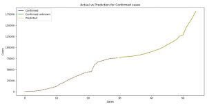
Image 1: The prediction for the confirmed Coronavirus (COVID-19) cases
On Image 1 you can see the plot where we compare the predictions and the actual values for the confirmed cases of the Coronavirus (COVID-19) cases.
With blue color, we have the already know values, or the values we used for training and with green, we have the unknown values that the model uses for prediction, and with a yellow dashed line is the function of the predicted values.
As you can see both of the functions (the yellow one and the blue and the green counting as one) are the same, which means we made a pretty good prediction. Now one of the reasons that this is possible because we have a really small dataset.
The code for prediction and plotting for the death and recovered cases is the same, so we do not need to explain it. What follows is the code and the images of the plots for the death and confirmed cases.
model.fit(date_death[“Deaths”][:30],date_death[“Deaths”][:30],epochs=20,)
prediction_death = model.predict(date_death[“Deaths”])
final_prediction_death = []
for i in range(0,len(prediction_death)):
final_prediction_death.append(prediction_death[i]*date_death[“Deaths”][i])
print(final_prediction_death)
plt.title(“Actual vs Prediction for Death cases”)
plt.xlabel(‘Dates’)
plt.ylabel(‘Cases’)
plt.plot(date_death[‘Deaths’][:30], label=‘Deaths’, color=‘blue’)
plt.plot(date_death[‘Deaths’][30:], label=‘Deaths unknown’, color=‘green’)
plt.plot(final_prediction_death, label=‘Predicted’, linestyle=‘dashed’, color=‘orange’)
plt.legend()
plt.show()
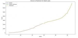
Image 2: The prediction for the death Coronavirus (COVID-19) cases
On Image 2 you can see the plot where we compare the predictions and the actual values for the death cases of the Coronavirus (COVID-19) cases. Here as well we have a perfect prediction.
model.fit(date_recovered[“Recovered”][:30],date_recovered[“Recovered”][:30],epochs=20,)
prediction_recovered = model.predict(date_recovered[“Recovered”])
final_prediction_recovered = []
for i in range(0,len(prediction_recovered)):
final_prediction_recovered.append(prediction_recovered[i]*date_recovered[“Recovered”][i])
print(final_prediction_recovered)
plt.title(“Actual vs Prediction for Recovered cases”)
plt.xlabel(‘Dates’)
plt.ylabel(‘Cases’)
plt.plot(date_recovered[‘Recovered’][:30], label=‘Recovered’, color=‘blue’)
plt.plot(date_recovered[‘Recovered’][30:], label=‘Recovered unknown’, color=‘green’)
plt.plot(final_prediction_recovered, label=‘Predicted’, linestyle=‘dashed’, color=‘orange’)
plt.legend()
plt.show()
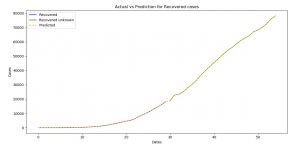
Image 3: The prediction for the recovered Coronavirus (COVID-19) cases using Deep Learning
On Image 3 you can see the plot where we compare the predictions and the actual values for the recovered cases of the Coronavirus (COVID-19) cases. Here as well we have a perfect prediction.
Python for Beginners – Buy from Amazon

Conclusion
Deep Learning is very powerful as we can see from this example. You can make predictions with high accuracy, but it definitely takes time to understand it better.
If you are new to Deep Learning we will suggest you read our articles about Get Started With Artificial Neural Networks and Learn More and Explanation of Keras for Deep Learning and Using It in Real World Problem.
Coronavirus (COVID-19) is a serious thing, and it is all around us. If we don’t act together, it will destroy not just our lives, but the lives of the generations that follow. That’s why it should be our mission to work on this threat together, as a unit, and to bring as much as we can to stop it.
If you want to see how you can predict the number of Coronavirus cases do visit our articles about:
- Forecasting the Spread of Coronavirus (COVID-19) Using Python (where we are using FbProphet)
- Predicting the Number of Infected People by the Coronavirus with Python Code (where we are using stochastic processes like AR, ARIMA, and SARIMA).
- Here’s How Machine Learning Can Help In The Fight Against Coronavirus (COVID-19)
- This Is How Python Can Defeat The Coronavirus (COVID-19)
Like with every post we do, we encourage you to continue learning, trying, and creating.
STAY SAFE!!!