The Coronavirus pandemic is a pandemic of coronavirus disease 2019 (COVID-19) caused by severe acute respiratory syndrome coronavirus 2 (SARS-CoV-2).
First identified in Wuhan, PR China, in December 2019, the outbreak spread to over 100 countries before being recognized as a pandemic by the World Health Organization 11 March 2020.
The coronavirus caused us to change our lifestyle for 180 degrees and just shown how fragile human nature is.
It caused the fall of many stocks on the stock markets across the world, food and medication crises, which will translate to the economic crisis in the near future.
However, in the darkest hours of our civilization, we must stand up and put our minds and effort into use, in order to save what we’ve created in these years of evolution.
Not long ago we’ve seen a competition on Kaggle (you can find it here), where the task is to predict how the virus is going to spread in the future.
The description of the problem and the requirements are on the link. There is also an explanation of which files you should use etc.
There are already a few kernels, we found one that we like a lot, so we’ve decided to improve it, by making our version of it.
The code of our solution will be available in this article. However the full project is on our GitHub profile, and you can access it by following this link:
You can also predict the number of infected people by a coronavirus with stochastic processes. To learn more about that, you can read our new blog post about predicting infected people by a coronavirus (COVID-19 and fighting against coronavirus (COVID-19 with machine learning.
Don’t forget to improve your knowledge by reading these books that are essential if you want to learn more about Machine Learning, Data Science, Python, Artificial Intelligence:
Time Series Analysis and Its Applications – Buy from Amazon

Time Series Analysis 1st Edition– Buy from Amazon

Deep Learning with Python 1st Edition – Buy from Amazon

Predicting the trend of the Coronavirus using Python
This problem is a time series analysis problem. We need to find the trend of it, so we are going to use one of the most popular libraries for that cause.
We are going to use the fbprophet library, which is created by Facebook. It is easy to use and to understand, but if you are new, we will suggest you follow this link to get familiar with fbprophet by Facebook.
In our solution, we are using one of the files, which is suggested by the creator of the problem. This file contains the information of how many confirmed, death and recovered cases were on a particular date (starting from 22 January 2020, until 16 March 2020), in a particular City/Province/State in the Country/Region where that city is.
Our predictions are made for the next month, but you can make a prediction for as long as you want period, which is very easy to set.
import pandas as pd
import numpy as np
from matplotlib import pyplot as plt
from fbprophet import Prophet
These are the libraries we are going to need. First three are probably familiar for you, since you may have worked in at least one Machine Learning or Data Science project. FbProphet can be a bit tricky to install, so I will suggest you the easiest way.
I will suggest you install Anaconda first, and then inside you will install the required libraries. When it comes to FbProphet, you will open your Anaconda Powershell Prompt, and there you will type one of the following lines:
conda install -c conda-forge fbprophet
conda install -c conda-forge/label/cf201901 fbprophet
If it still makes problems, then first you will install the pystan library through the “Environments” window in your Anaconda Navigator, and then you will type one of the following lines. If it does not work, try to update your Anaconda.
df = pd.read_csv(‘datasets/covid_19_data.csv’,parse_dates=[‘Last Update’])
df.rename(columns={‘ObservationDate‘:‘Date’, ‘Country/Region’:‘Country’}, inplace=True)
Then we are reading the file we are going to use, and we are creating a pandas data frame straightaway.

Image 1: The data format
df_date = df.groupby([“Date”])[[‘Confirmed’, ‘Deaths’, ‘Recovered’]].sum().reset_index()
df_country = df.groupby([“Country”])[[‘Confirmed’, ‘Deaths’, ‘Recovered’]].sum().reset_index()
date_x_ticks = []
country_x_ticks = []
date_confirmed=[]
date_deaths=[]
date_recovered=[]
country_confirmed = []
country_deaths = []
country_recovered = []
for index, row in df_date.iterrows():
date_x_ticks.append(row[‘Date’])
date_confirmed.append(row[‘Confirmed’])
date_deaths.append(row[‘Deaths’])
date_recovered.append(row[‘Recovered’])
for index, row in df_country.iterrows():
country_x_ticks.append(row[‘Country’])
country_confirmed.append(row[‘Confirmed’])
country_deaths.append(row[‘Deaths’])
country_recovered.append(row[‘Recovered’])
With the code above we are organizing the data by date in the df_date variable and by country, in the df_country variable.
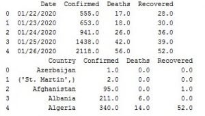
Image 2: Data organized by date and country
Now we are not going to need the data organized by country, since we are using fbprophet by Facebook which needs date stamp to work, but we wanted to show you cool visualization using the data organized by country.
date_x_ticks = []
country_x_ticks = []
date_confirmed=[]
date_deaths=[]
date_recovered=[]
country_confirmed = []
country_deaths = []
country_recovered = []
for index, row in df_date.iterrows():
date_x_ticks.append(row[‘Date’])
date_confirmed.append(row[‘Confirmed’])
date_deaths.append(row[‘Deaths’])
date_recovered.append(row[‘Recovered’])
for index, row in df_country.iterrows():
country_x_ticks.append(row[‘Country’])
country_confirmed.append(row[‘Confirmed’])
country_deaths.append(row[‘Deaths’])
country_recovered.append(row[‘Recovered’])
With the code above, we are taking the date values, the values for the confirmed, death and recovered cases, for the date data frame and the country data frame. The lists have conventional names, so you understand what is going on.
#plt.xticks(np.arange(len(date_x_ticks)), date_x_ticks)
plt.xlabel(‘Dates’)
plt.ylabel(‘Cases’)
plt.plot(date_confirmed, label=‘Confirmed’, color=‘blue’)
plt.plot(date_deaths, label=‘Deaths’, color=‘red’)
plt.plot(date_recovered, label=‘Recovered’, color=‘green’)
plt.title(“Coronavirus cases in the world by date”)
plt.legend()
plt.show()
With the code above we are creating a plot, where we are plotting the data for the date data frame. The first line that is commented adds the dates on the x-axis, but since there is a lot of data it won’t be visible. So for most of the plots on the x-axis you are going to see some numbers.

Image 3: Coronavirus (COVID-19) cases in the world by date
On Image 3 you can see the cases of Coronavirus (COVID-19) in the world organized by date.
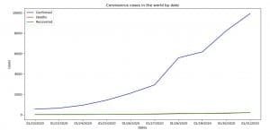
Image 4: Coronavirus (COVID-19) cases in the world by date (dates on x-axis)
On Image 4 you can see how it would’ve looked like if we use dates on x-axis, but the thing is, on this plot we’ve plotted only the first ten dates. The code of how we’ve done that is bellow.
plt.xticks(np.arange(len(date_x_ticks[:10])), date_x_ticks[:10])
plt.xlabel(‘Dates’)
plt.ylabel(‘Cases’)
plt.plot(date_confirmed[:10], label=‘Confirmed’, color=‘blue’)
plt.plot(date_deaths[:10], label=‘Deaths’, color=‘red’)
plt.plot(date_recovered[:10], label=‘Recovered’, color=‘green’)
plt.title(“Coronavirus cases in the world by date”)
plt.legend()
plt.show()
With the code below we are plotting the data for the country data frame.
plt.xlabel(‘Countries’)
plt.ylabel(‘Cases’)
plt.bar(np.arange(len(country_confirmed)), country_confirmed, align=‘center’, alpha=0.5, color=‘blue’, label=‘Confirmed’)
plt.bar(np.arange(len(country_deaths)), country_deaths, align=‘center’, alpha=0.5, color=‘red’, label=‘Deaths’)
plt.bar(np.arange(len(country_recovered)), country_recovered, align=‘center’, alpha=0.5, color=‘green’, label=‘Recovered’)
plt.title(“Coronavirus cases in the world by country”)
plt.legend()
plt.show()
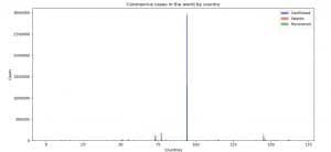
Image 5: Coronavirus (COVID-19) cases in the world by country
On Image 5 you can see Coronavirus (COVID-19) cases in the world organized by country.

Image 6: Coronavirus (COVID-19) cases in the world by country (countries x-axis)
On Image 6 is shown an example of how the plot would’ve looked like if we were adding the countries on the x-axis. The thing is, we plotted only 5 countries for this example, since their names are long, and there is no visibility on the plot. We are doing this with the code below.
plt.xticks(np.arange(len(country_x_ticks[:5])), country_x_ticks[:5])
plt.bar(np.arange(len(country_confirmed[:5])), country_confirmed[:5], align=‘center’, alpha=0.5, color=‘blue’, label=‘Confirmed’)
plt.bar(np.arange(len(country_deaths[:5])), country_deaths[:5], align=‘center’, alpha=0.5, color=‘red’, label=‘Deaths’)
plt.bar(np.arange(len(country_recovered[:5])), country_recovered[:5], align=‘center’, alpha=0.5, color=‘green’, label=‘Recovered’)
plt.xlabel(‘Countries’)
plt.ylabel(‘Cases’)plt.title(“Coronavirus cases in the world by country”)
plt.legend()
plt.show()
The next thing we must do is to organize the data in a format that the fbprophet model by Facebook is going to understand.
date_confirmed_prophet = df_date[[‘Date’, ‘Confirmed’]]
date_death_prophet = df_date[[‘Date’, ‘Deaths’]]
date_recovered_prophet = df_date[[‘Date’, ‘Recovered’]]
date_confirmed_prophet.columns = [‘ds’, ‘y’]
date_death_prophet.columns = [‘ds’, ‘y’]
date_recovered_prophet.columns = [‘ds’, ‘y’]
We’ve created three variables where we take the data for the confirmed, death and recovered cases. We change the names of the columns to ds for the datastamp and y for the number of cases. That is the way the fbprophet model understands.
model_confirmed = Prophet(interval_width=0.99)
model_confirmed.fit(date_confirmed_prophet)
future_confirmed = model_confirmed.make_future_dataframe(periods=30)
forecast_confirmed = model_confirmed.predict(future_confirmed)
With the code above, we are making the forecast for the confirmed cases. First, we create the model and we are saying that we want a confidence interval of 99%.
Then we pass the data with the fit() method. Then we add the period for which we want to predict the data, in our case that is the next 30 days. By default, it will plus include the data that we fitted (we need that for the last plots).
The last step is calling the predict() method which will make the prediction.
The forecast has many attributes, but the attribute of our interest is that attribute, which the prediction of y.
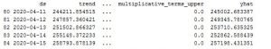
Image 7: Predicted data format
Image 7: Predicted data format
forecast_confirmed_yhat = []
forecast_confirmed_yhat_u = []
forecast_confirmed_yhat_l = []
for index, row in forecast_confirmed.iterrows():
forecast_confirmed_yhat.append(row[‘yhat’])
forecast_confirmed_yhat_l.append(row[‘yhat_lower’])
forecast_confirmed_yhat_u.append(row[‘yhat_upper’])
plt.xlabel(‘Dates’)
plt.ylabel(‘Cases’)
plt.plot(forecast_confirmed_yhat, label=‘Prediction’, color=‘blue’)
plt.plot(forecast_confirmed_yhat_l, label=‘Prediction lower’, color=‘red’)
plt.plot(forecast_confirmed_yhat_u, label=‘Predicition upper’, color=‘green’)
plt.title(“Forecast of confirmed cases “)
plt.legend()
plt.show()
With the code above we are organizing the data on a way similar as before. This time we are going to plot the predicted value for the confirmed cases, along with the lower and upper boundary of the trust interval (uncertainty interval).
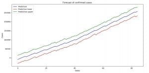
Image 8: Forecast with uncertainty interval boundaries (confirmed cases)
The code and the plots for the death and recovered cases with their forecasts and uncertainty interval boundaries are the same. So what follows is the code and the results.
plt.xlabel(‘Dates’)
plt.ylabel(‘Cases’)
plt.plot(forecast_death_yhat, label=‘Prediction’, color=‘blue’)
plt.plot(forecast_death_yhat_l, label=‘Prediction lower’, color=‘red’)
plt.plot(forecast_death_yhat_u, label=‘Predicition upper’, color=‘green’)
plt.title(“Forecast of death cases “)
plt.legend()
plt.show()
model_recovered = Prophet(interval_width=0.99)
model_recovered.fit(date_recovered_prophet)
future_recovered = model_recovered.make_future_dataframe(periods=30)
forecast_recovered = model_recovered.predict(future_recovered)
dates_forecast_recovered = []
forecast_recovered_yhat = []
forecast_recovered_yhat_u = []
forecast_recovered_yhat_l = []
for index, row in forecast_recovered.iterrows():
dates_forecast_recovered.append(row[‘ds’])
forecast_recovered_yhat.append(row[‘yhat’])
forecast_recovered_yhat_l.append(row[‘yhat_lower’])
forecast_recovered_yhat_u.append(row[‘yhat_upper’])
plt.xlabel(‘Dates’)
plt.ylabel(‘Cases’)
plt.plot(forecast_recovered_yhat, label=‘Prediction’, color=‘blue’)
plt.plot(forecast_recovered_yhat_l, label=‘Prediction lower’, color=‘red’)
plt.plot(forecast_recovered_yhat_u, label=‘Predicition upper’, color=‘green’)
plt.title(“Forecast of recovered cases”)
plt.legend()
plt.show()
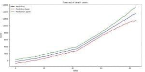
Image 9: Forecast with uncertainty interval boundaries (death cases)

Image 10: Forecast with uncertainty interval boundaries (recovered cases)
plt.xlabel(‘Dates’)
plt.ylabel(‘Cases’)
plt.plot(forecast_confirmed_yhat, label=‘Confirmed’, color=‘blue’)
plt.plot(forecast_death_yhat, label=‘Death’, color=‘red’)
plt.plot(forecast_recovered_yhat, label=‘Recovered’, color=‘green’)
plt.title(“Forecast of Coronavirus cases”)
plt.legend()
plt.show()
With the code above we are plotting the forecast of the confirmed, death and recovered cases.
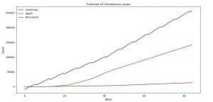
Image 11: Forecast of Coronavirus (COVID-19) for the next 30 days
On Image 11 you can see the prediction that we made using the fbprobhet library by Facebook for the spread of the Coronavirus (COVID-19) for the next 30 days.
Now keep in mind, we are doing the prediction, not taking account that the situation might get better if the people keep staying home, or somebody finds some sort of medication that will stop the growing trend. For the sake of everyone, we hope we are wrong.
At the end of this article, we will plot the current values and the forecasted values just to see how the situation around Coronavirus (COVID-19) is going to change for the confirmed, death and recovered cases.
date_confirmed_prophet_y = []
date_recovered_prophet_y = []
date_death_prophet_y = []
for index, row in date_confirmed_prophet.iterrows():
date_confirmed_prophet_y.append(row[‘y’])
for index, row in date_death_prophet.iterrows():
date_death_prophet_y.append(row[‘y’])
for index, row in date_recovered_prophet.iterrows():
date_recovered_prophet_y.append(row[‘y’])
With the code above we are taking the y value from the current data that we’ve used for prediction.
Next thing, we are going to plot that data with the appropriate forecasted data. With the code below we are plotting the current data for the confirmed cases and the forecasted data for the confirmed cases for Coronavirus (COVID-19).
plt.xlabel(‘Dates’)
plt.ylabel(‘Cases’)
plt.plot(forecast_confirmed_yhat, label = ‘Confirmed forecast’)
plt.plot(date_confirmed_prophet_y, label = ‘Confirmed’)
plt.title(“Confirmed vs Confirmed forecast Coronavirus”)
plt.legend()
plt.show()

Image 12: Confirmed versus a confirmed forecast for Coronavirus (COVID-19)
On Image 12 you can see the current state of the confirmed cases of Coronavirus (COVID-19) versus the forecasted by our model.
The code for the death cases and the recovered cases is pretty much the same, so we are not going to explain it.
plt.xlabel(‘Dates’)
plt.ylabel(‘Cases’)
plt.plot(forecast_death_yhat, label = ‘Death forecast’)
plt.plot(date_death_prophet_y, label = ‘Death’)
plt.title(“Death vs Death forecast Coronavirus”)
plt.legend()
plt.show()
plt.xlabel(‘Dates’)
plt.ylabel(‘Cases’)
plt.plot(forecast_recovered_yhat, label = ‘Recovered forecast’)
plt.plot(date_recovered_prophet_y, label = ‘Recovered’)
plt.title(“Recovered vs Recovered forecast Coronavirus”)
plt.legend()
plt.show()

Image 13: Death versus Death forecasts for Coronavirus (COVID-19)

Image 14: Recovered versus Recovered forecasts for Coronavirus (COVID-19)
We have two more books to recommend you that are amazing and you must read if you liked this article:
Pattern Recognition and Machine Learning – Buy from Amazon

Hands-On Machine Learning with Scikit-Learn and TensorFlow – Buy from Amazon

Conclusion
Coronavirus (COVID-19) is a serious thing, and it is all around us. If we don’t act together, it will destroy not just our lives, but the lives of the generations that follow. That’s why it should be our mission to work on this threat together, as a unit, and to bring as much as we can to stop it.
Our solution is just a variation to many others that you can find on this competition on kaggle.com, and is a perfect example of what the area of Artificial Intelligence is capable of when it is used in the right way.
Don’t forget to read our second blog post about predicting the number of infected people by the coronavirus with Python.
We also have other useful articles about this topic and by reading all of them, you can understand this better and it will be easier for you to do such things:
- This Is How Python Can Defeat The Coronavirus (COVID-19)
- How To Predict Coronavirus (COVID-19) Cases Using Deep Learning in Python
We encourage every single one you to open the competition and try to solve the problem. You can take our solution and improve it, as we plan to do in the next days.
We are going to make predictions using ARIMA models, XGBOOST and LIGHT BOOST methods, and we are going to try to make a Deep Learning model. We will be glad if you try it before us. If you do, let us know about the results.
Remember, the better-organized solution you can find on our GitHub:
Like with every post we do, we encourage you to continue learning, trying and creating.